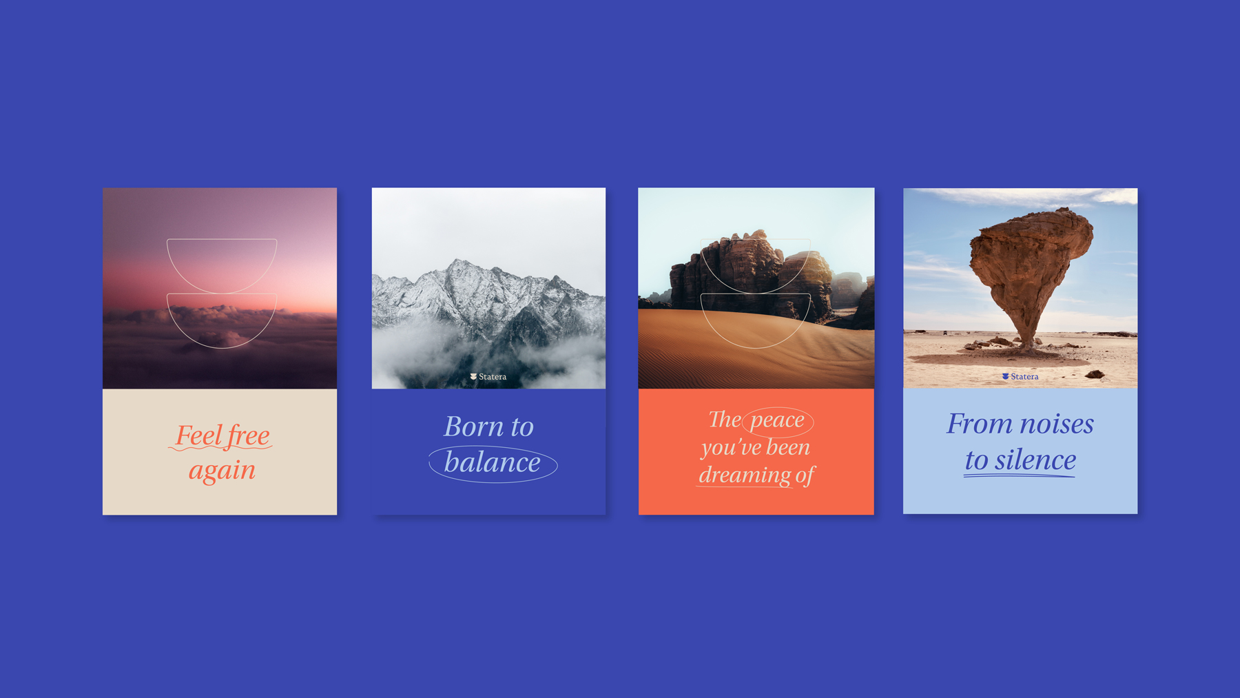
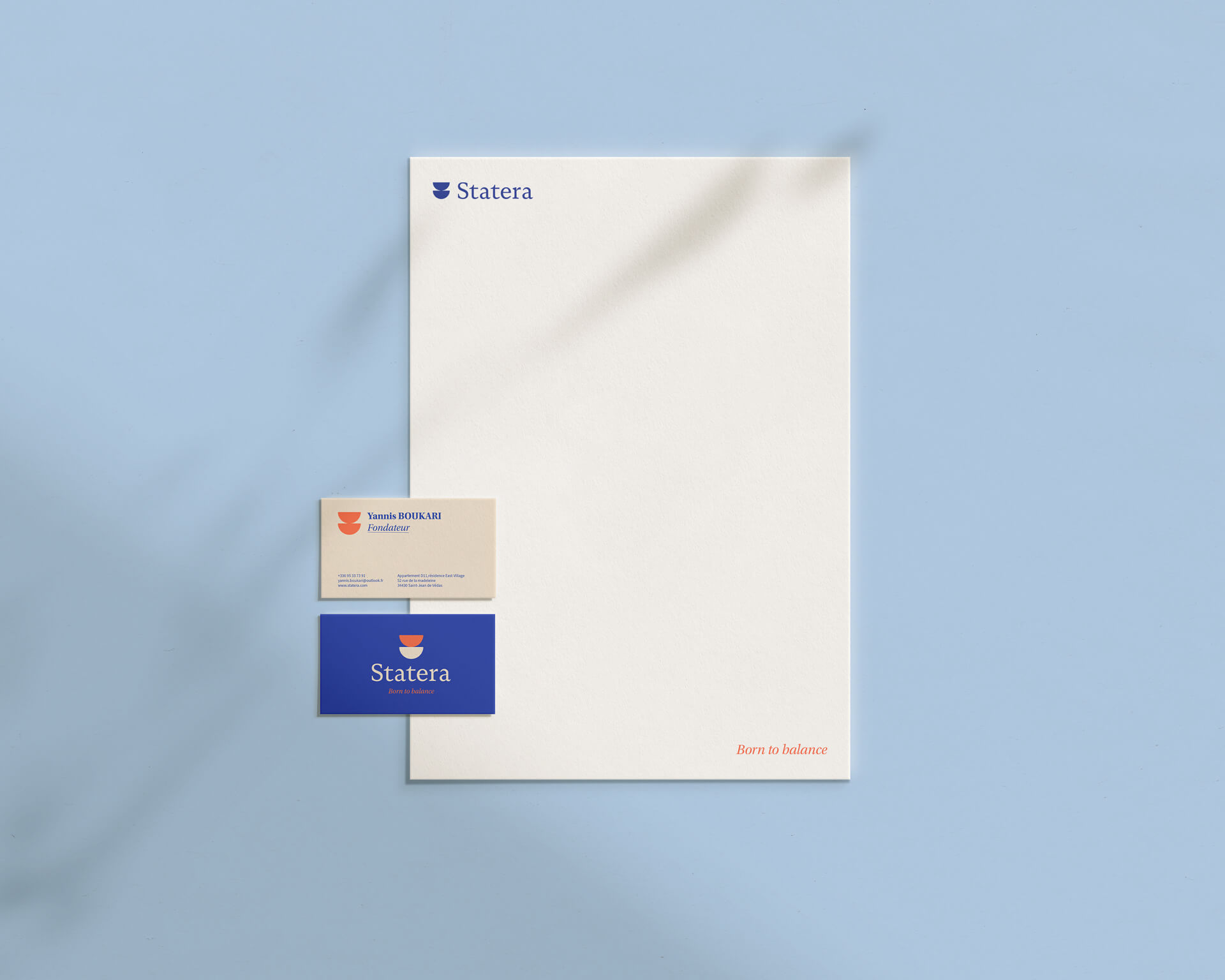
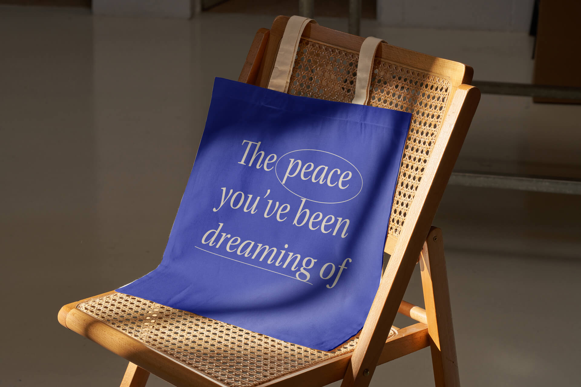
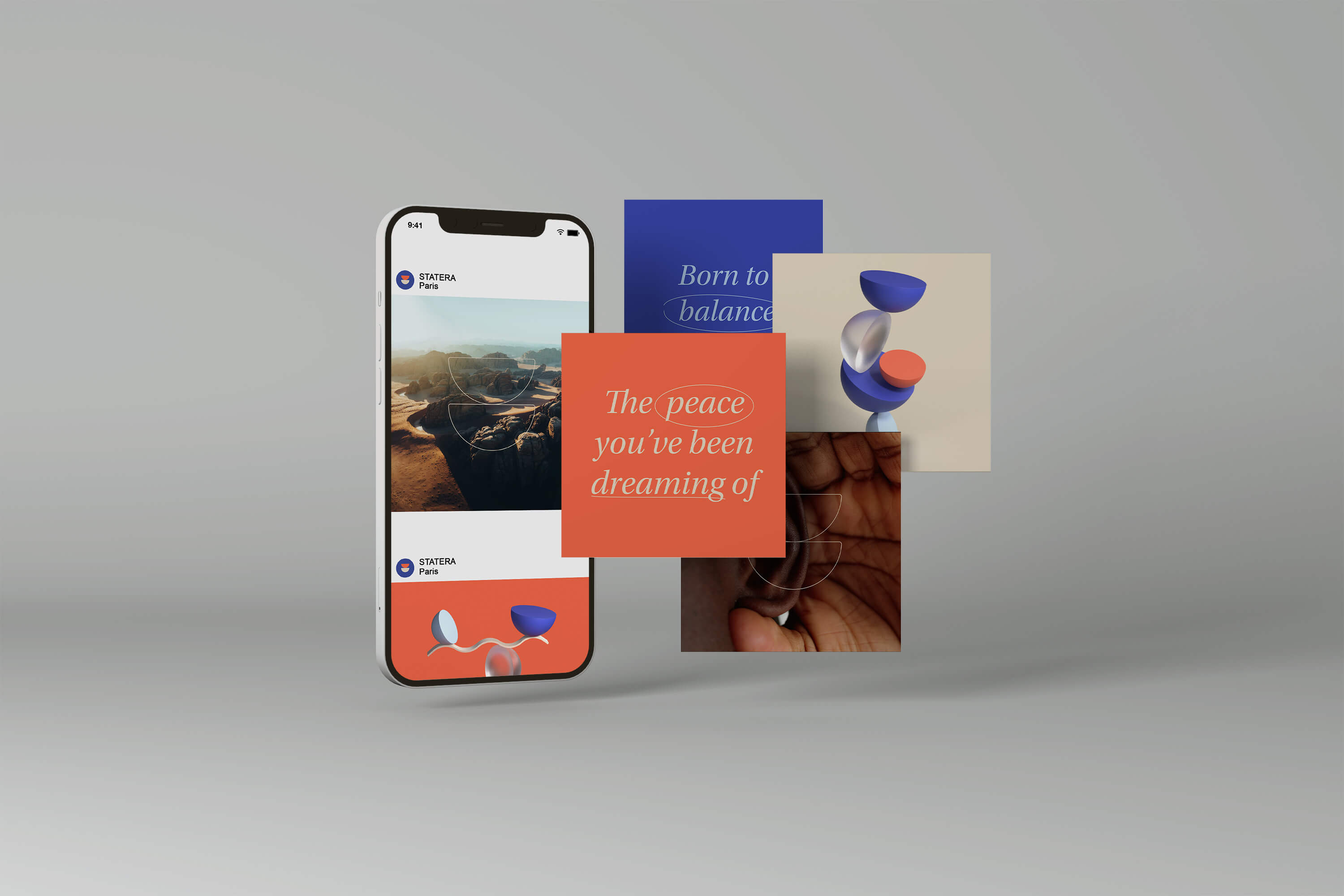
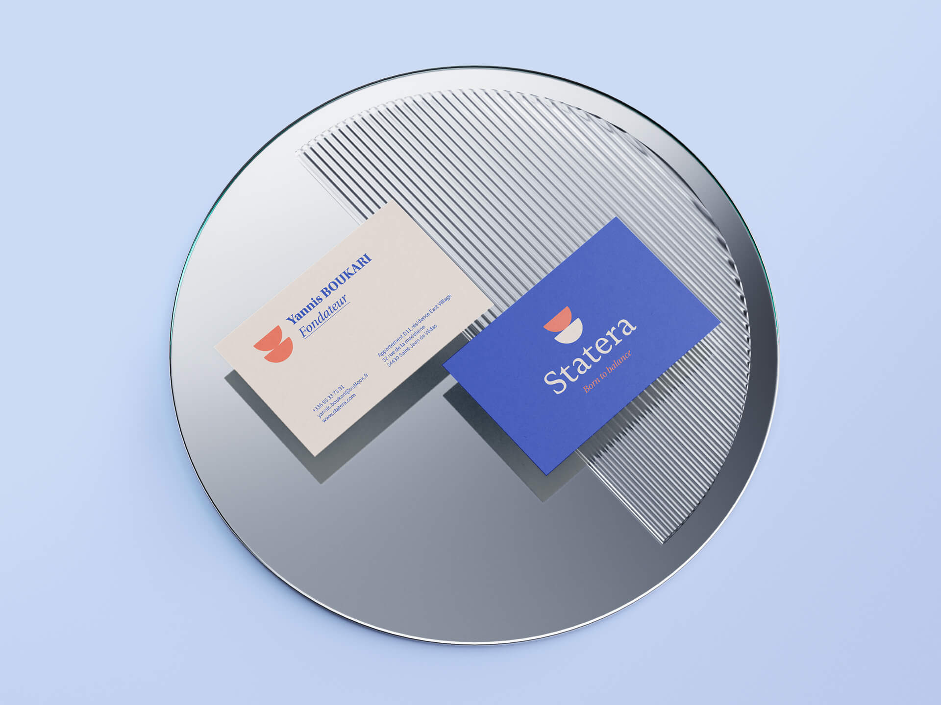
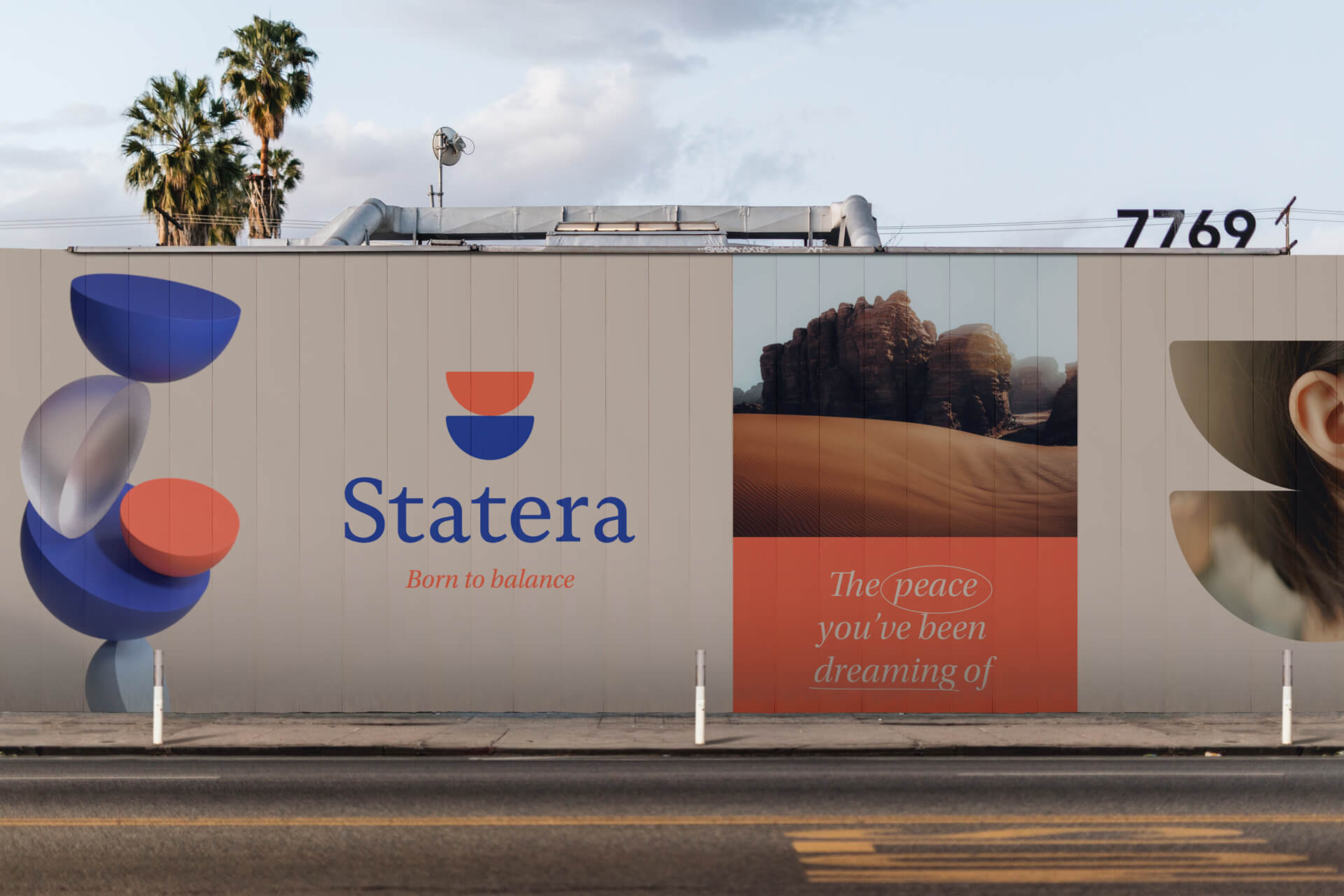
In collaboration with Yannis, creator of STATERA, we forged a visual identity imbued with serenity. Our collaborative process began with the creation of STATERA's brand platform, an in-depth exploration of Yannis' values and mission. This allowed us to crystallize a visual identity imbued with human warmth. The italic typography encourages connection, while the minimalist logo, composed of two perfectly symbiotic semicircles, embodies the idea of stability and balance, a visual metaphor for the name “Statera,” meaning balance in Latin. The introduction of vast landscapes into this visual identity brings a touch of nature and serenity, reinforcing the sense of calm that STATERA seeks to offer. STATERA stands as a beacon of hope, a hand reaching out toward a future where silence regains its tranquility.